iOS Notifications
Redesigning notifications on iOS for an improved experience


My Role
User Research
Product Design
Type
Passion Project
Team
Individual
Tools
Balsamiq
Figma
Timeline
Jan 2021
(4 Weeks)
Overview
iOS is a mature platform, but its notification center still falls behind with its primitive design, bare minimum functionality, and unintuitive flow. When I faced trouble with iOS notifications, I decided to take this passion project and proposed changes to improve user experience.
Design Challenge
How can the iOS Notification Center be improved to provide a better user experience?
Why this challenge?
I switched from Android to iOS and immediately noticed the difference in notification experience 📲
I switched to an iPhone primarily because I wanted a different software experience. Coming from the Android ecosystem, I was used to easy actions and feature-rich functionality of the notifications. However, on iOS, I felt it was too troublesome to get something done. So I decided to make it better myself.
What purpose do the notifications serve? 🤔
Notifications are a channel for apps to communicate important information and alerts to users. The notification center serves as a place to display all the notifications, and each notification provides the ability to take appropriate actions.
User Research
What do the users need?
There are four types of people 👫
I interviewed 15 iPhone users and categorised them in four broad buckets based on their usage patterns.
01
The one who clears all
  • closes all the notifications without noticing them
  • always has an empty notification center
02
The average user
  • makes decent use of the notification center
  • checks on the notifications and their content
03
The power user
  • makes the most out of notification center
  • uses notifications to reply to messages, check reminders, etc.
04
The one who doesn't care
  • rarely opens the notification center
  • a long list of notifications lies unattended
...and their needs & expectations vary
Not all users have similar requirements because their usage differs. Type 3 users make the most out of notifications. These users benefit from an improved notification center because they want to do more. This is the category of users that I decided to focus on.
Competitive Research
Android does it better, and there is no harm in taking inspiration 💡
The Android notification shade has been a true pinnacle because of its simplicity, minimalism, and powerful functionality.
Quick Replies
The option to reply to any message is right there on the notification card. Just a tap and the keyboard appears.
Smart Suggestions
In recent Android updates, replying to conversations from notifications has become easier. Smart suggestions are present right below the notification content. All one needs to do is tap on the suggested reply, and done, the reply is sent!
Relevant Actions
One can take relevant and appropriate actions on a notification. May it be marking a message as read, archiving an email, opening a link, or copying OTP - all of these can be done just with a tap.
Snoozing Notifications
A swipe in either direction on the notification card reveals an icon to snooze, and that is it. One can also choose the amount of time the notification is snoozed for.
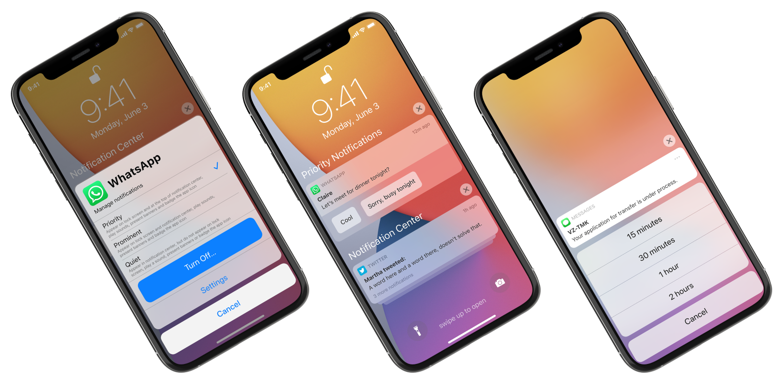
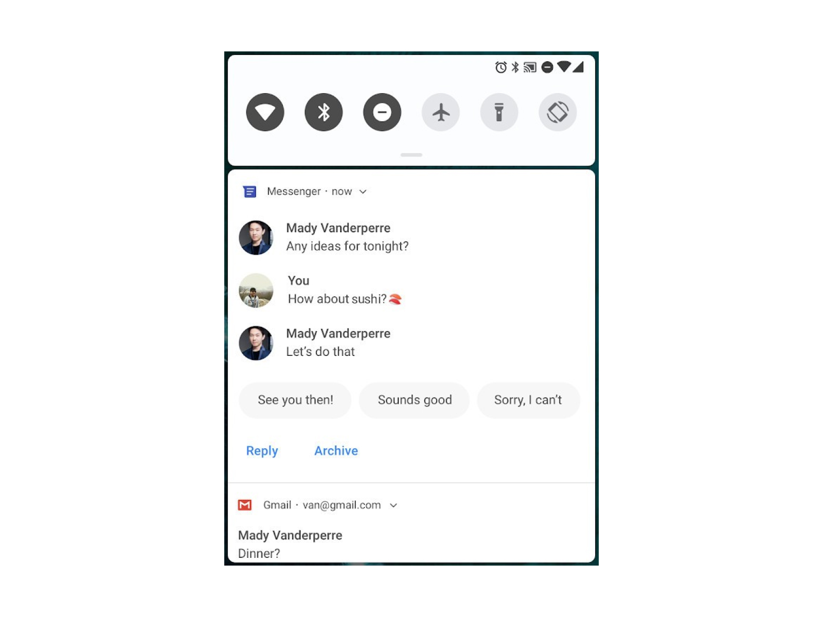
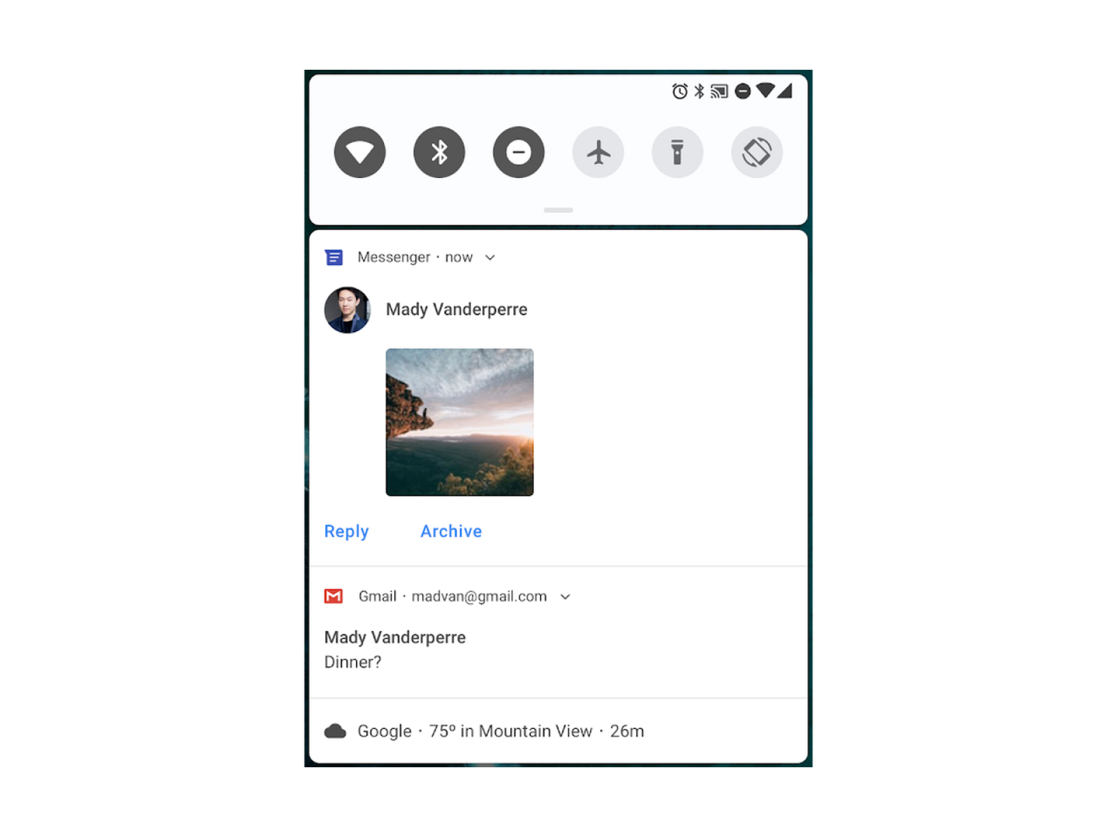
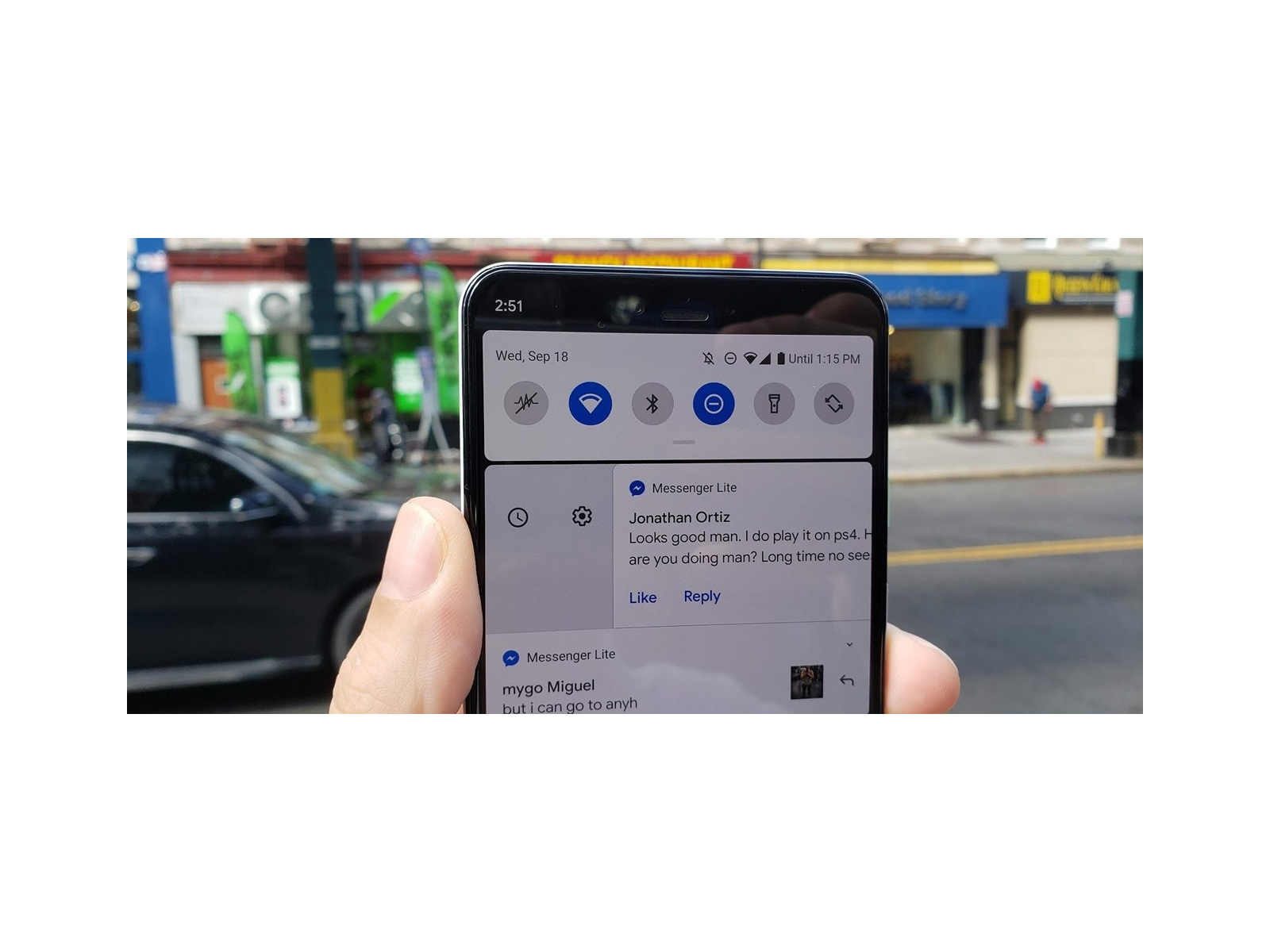
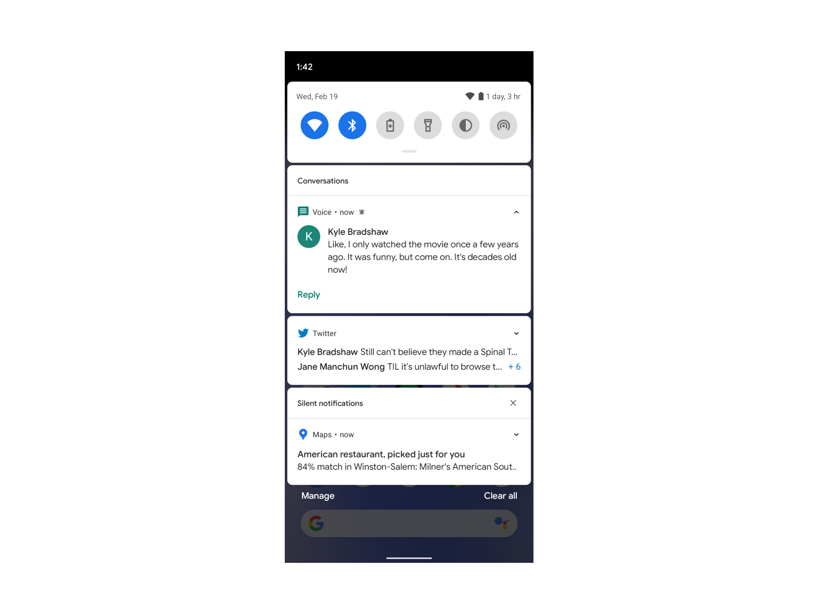
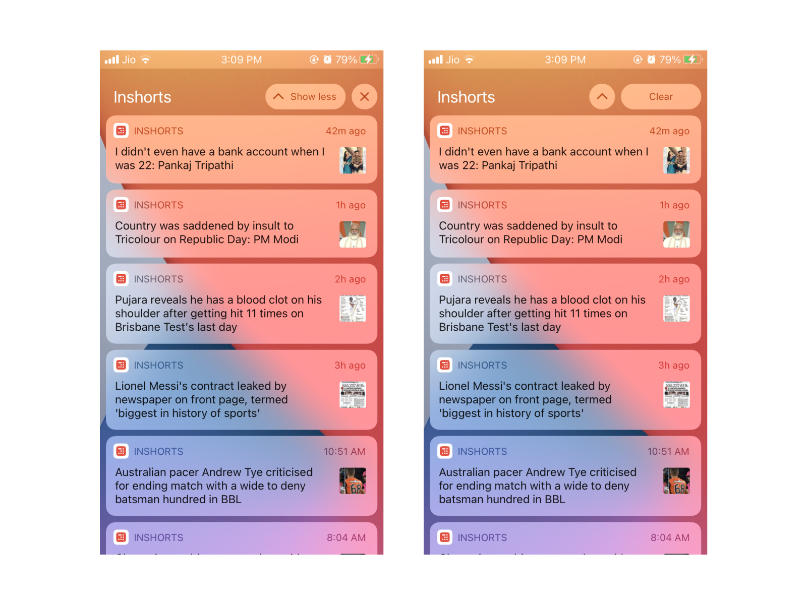
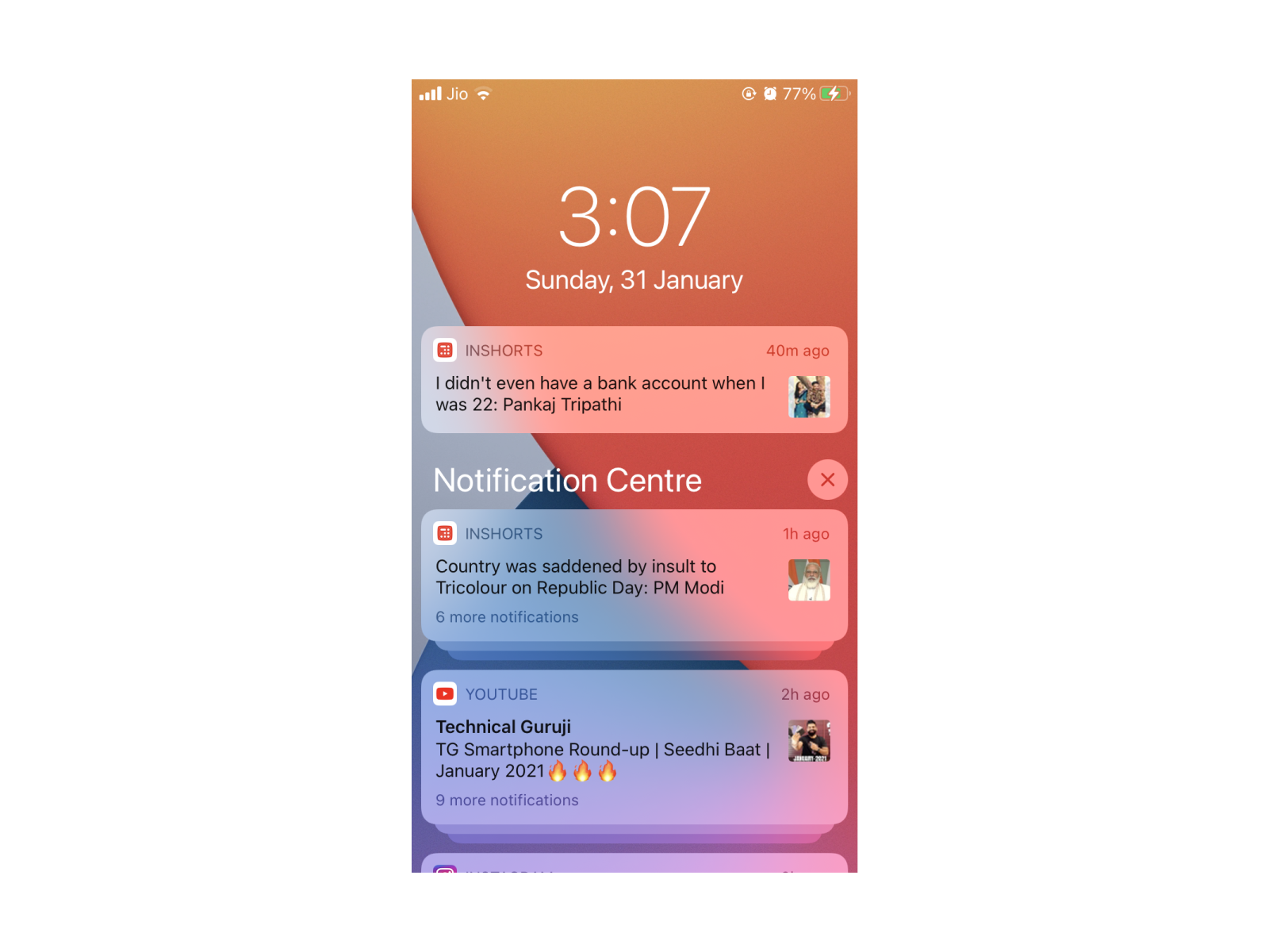
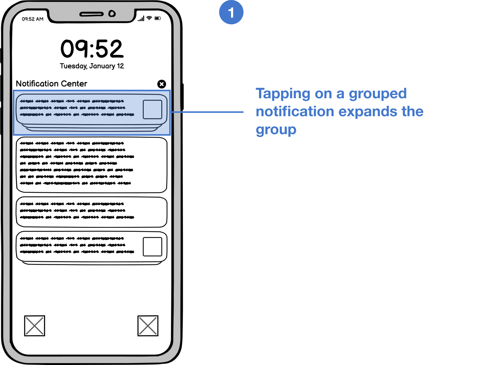
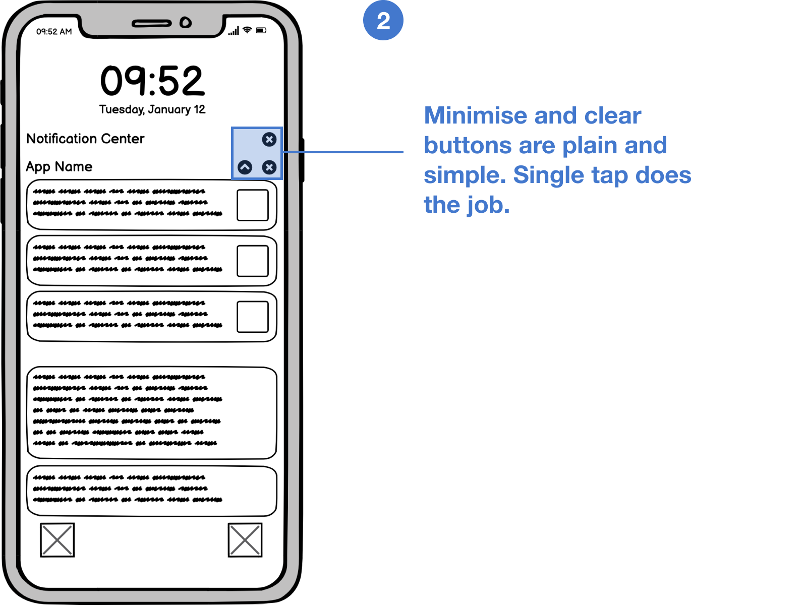
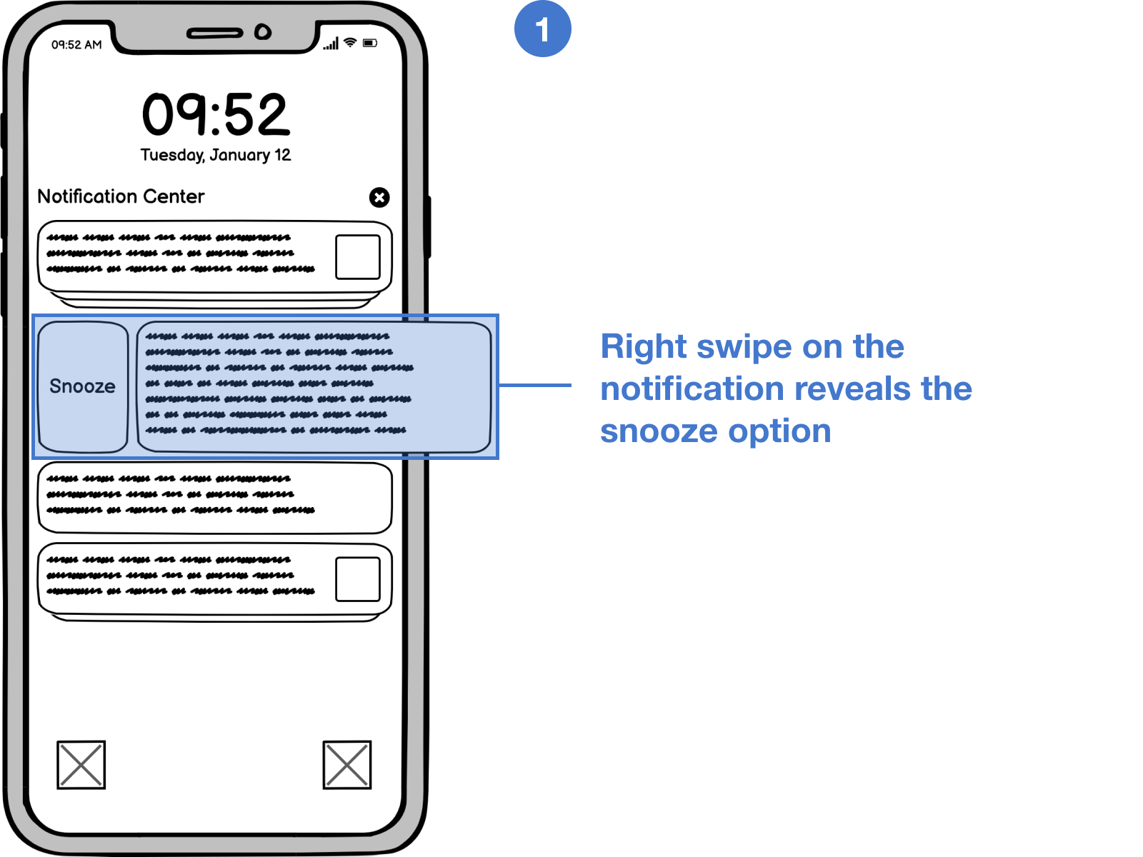
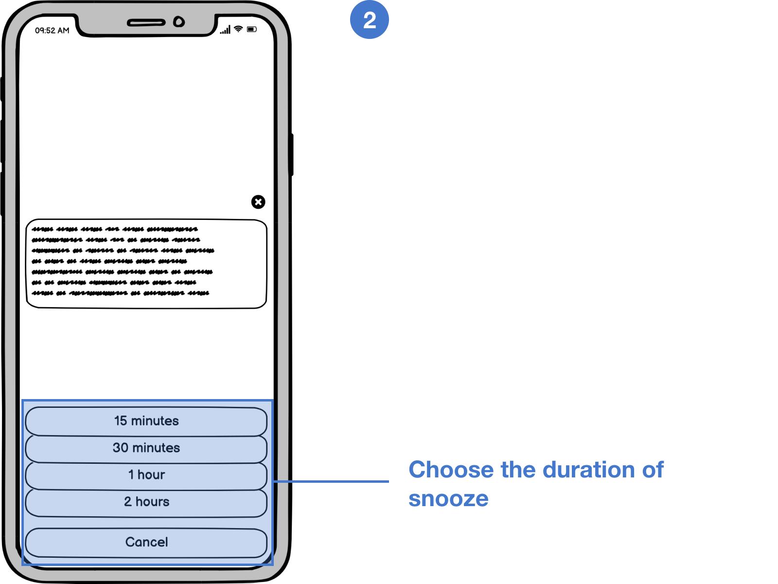
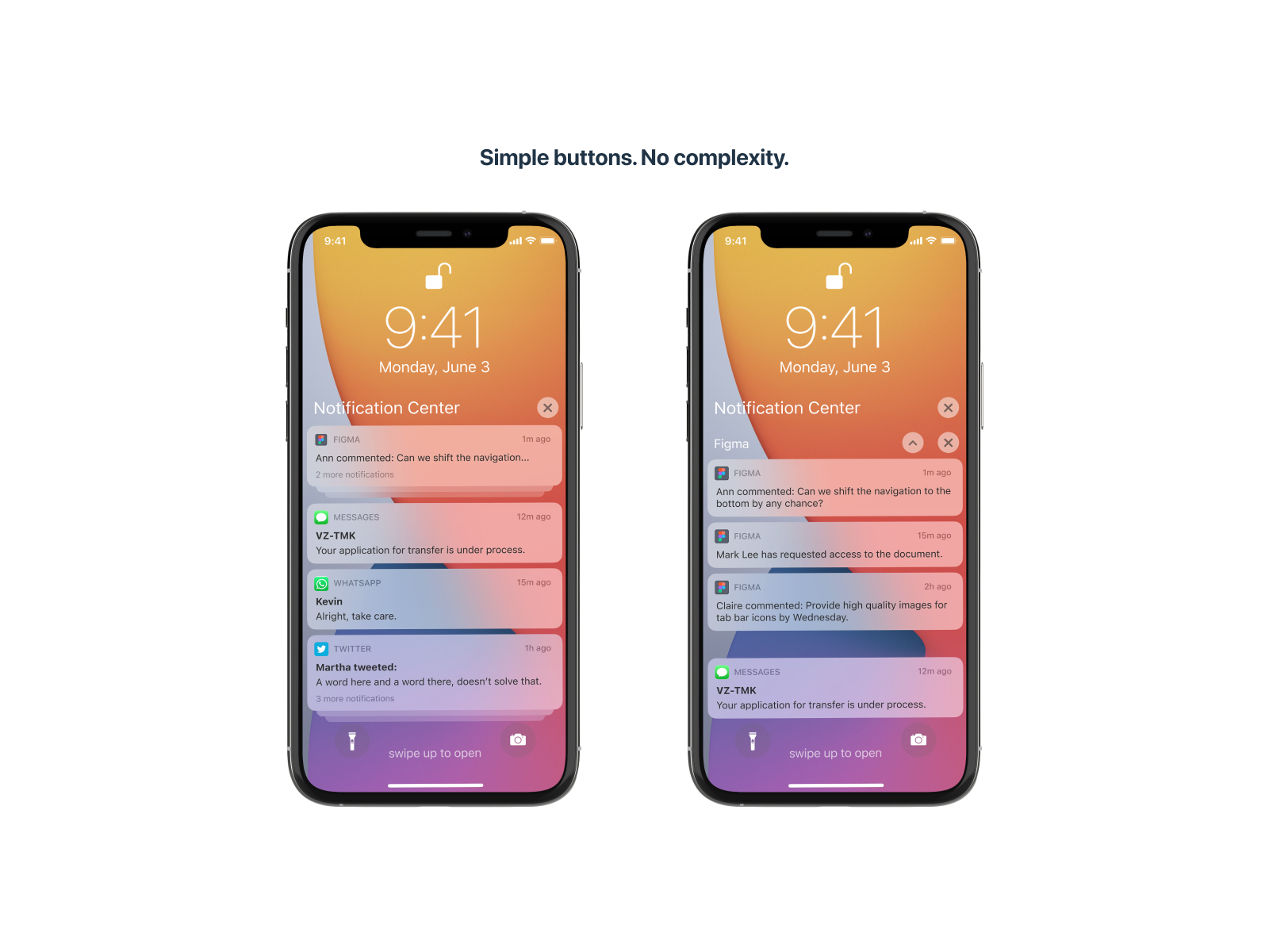
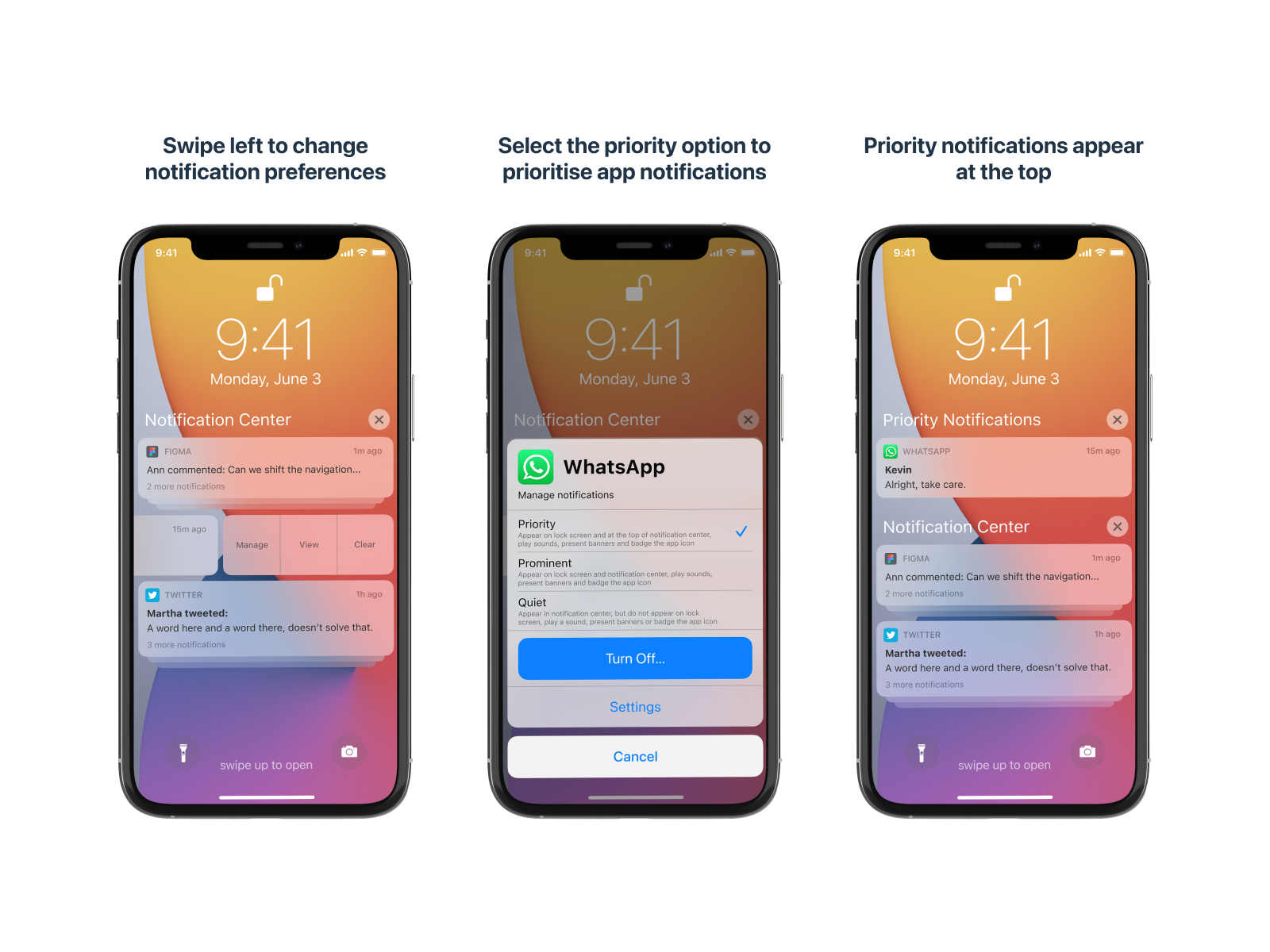
Notification Categorisation
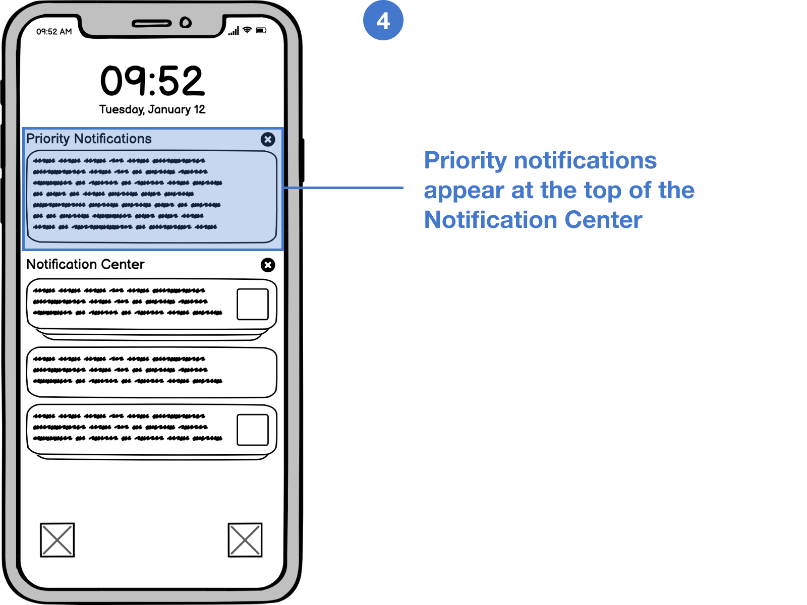
With Android 11, notifications regarding conversations and messages are grouped at the top, while others are grouped below, and finally, the silent notifications appear at the bottom. 
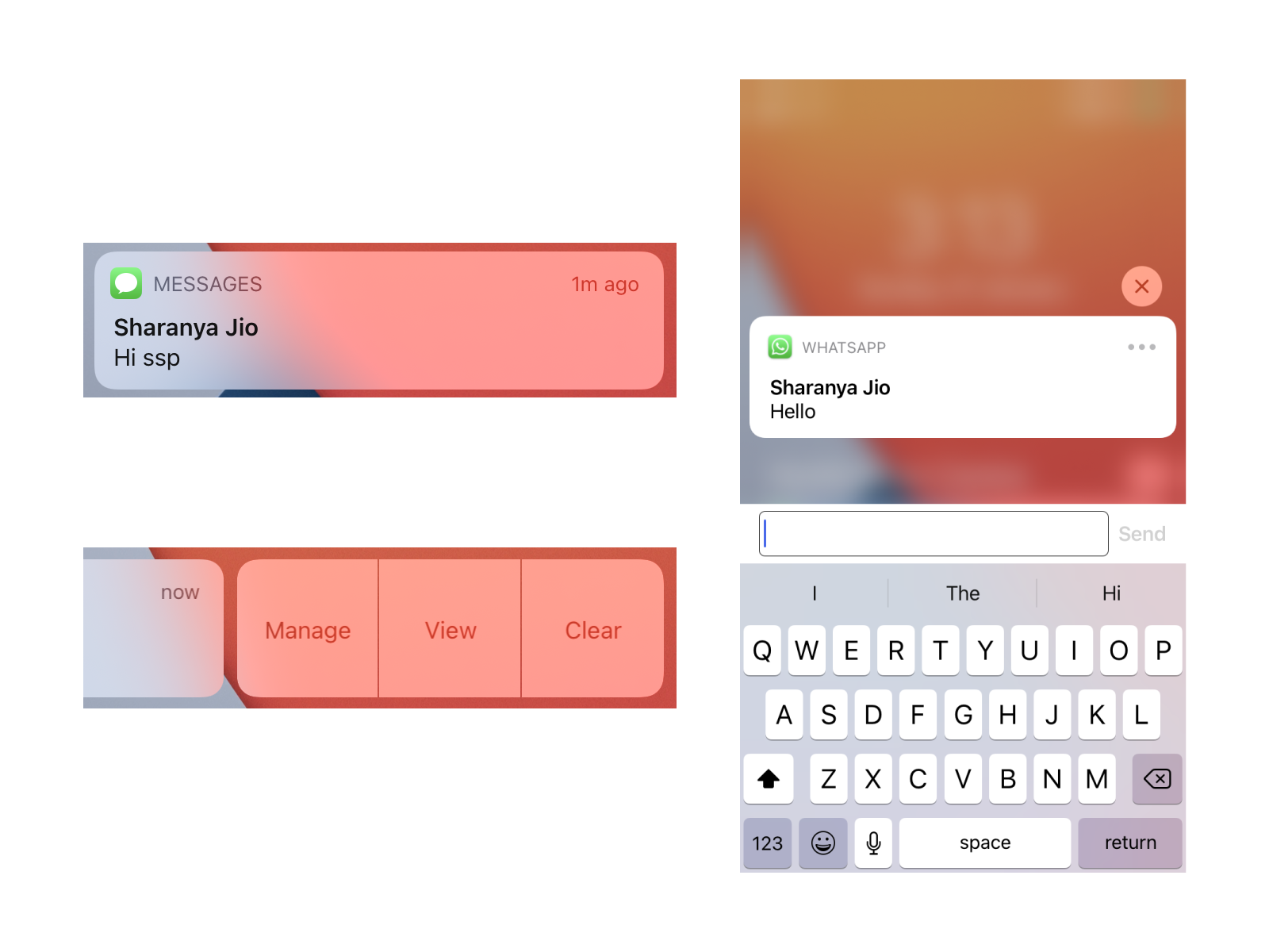
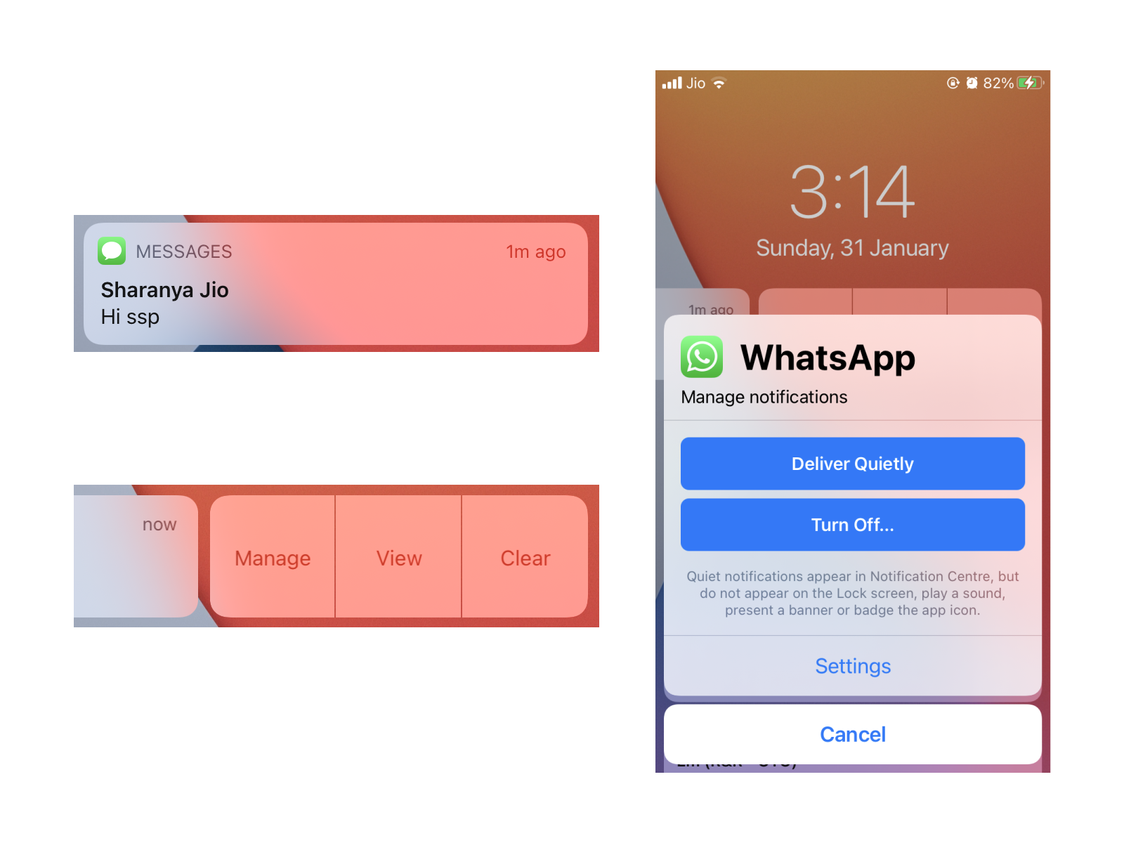
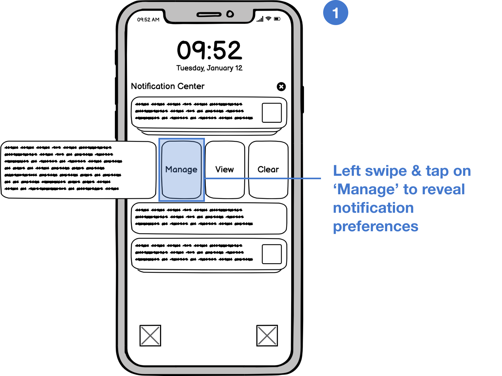
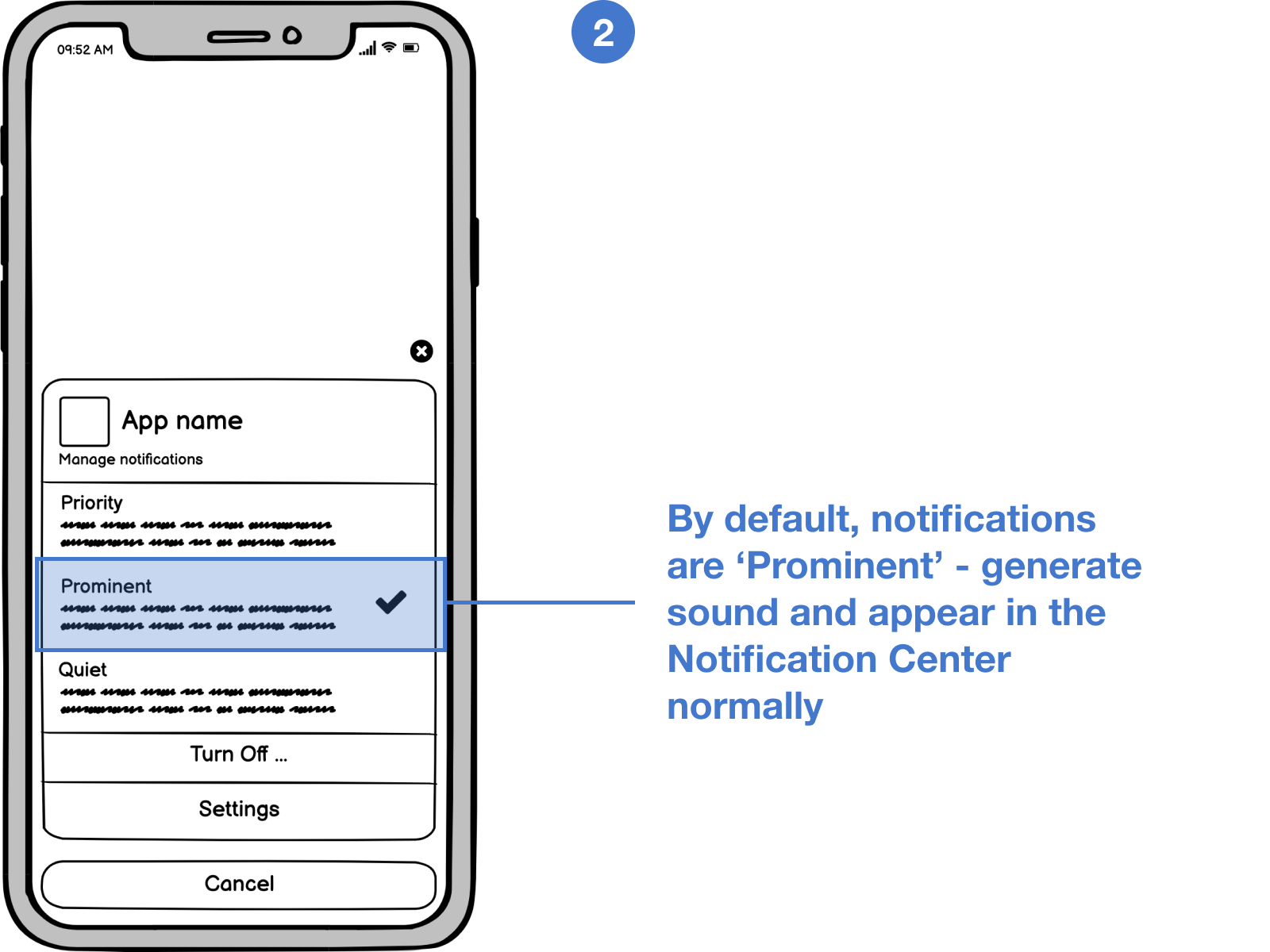
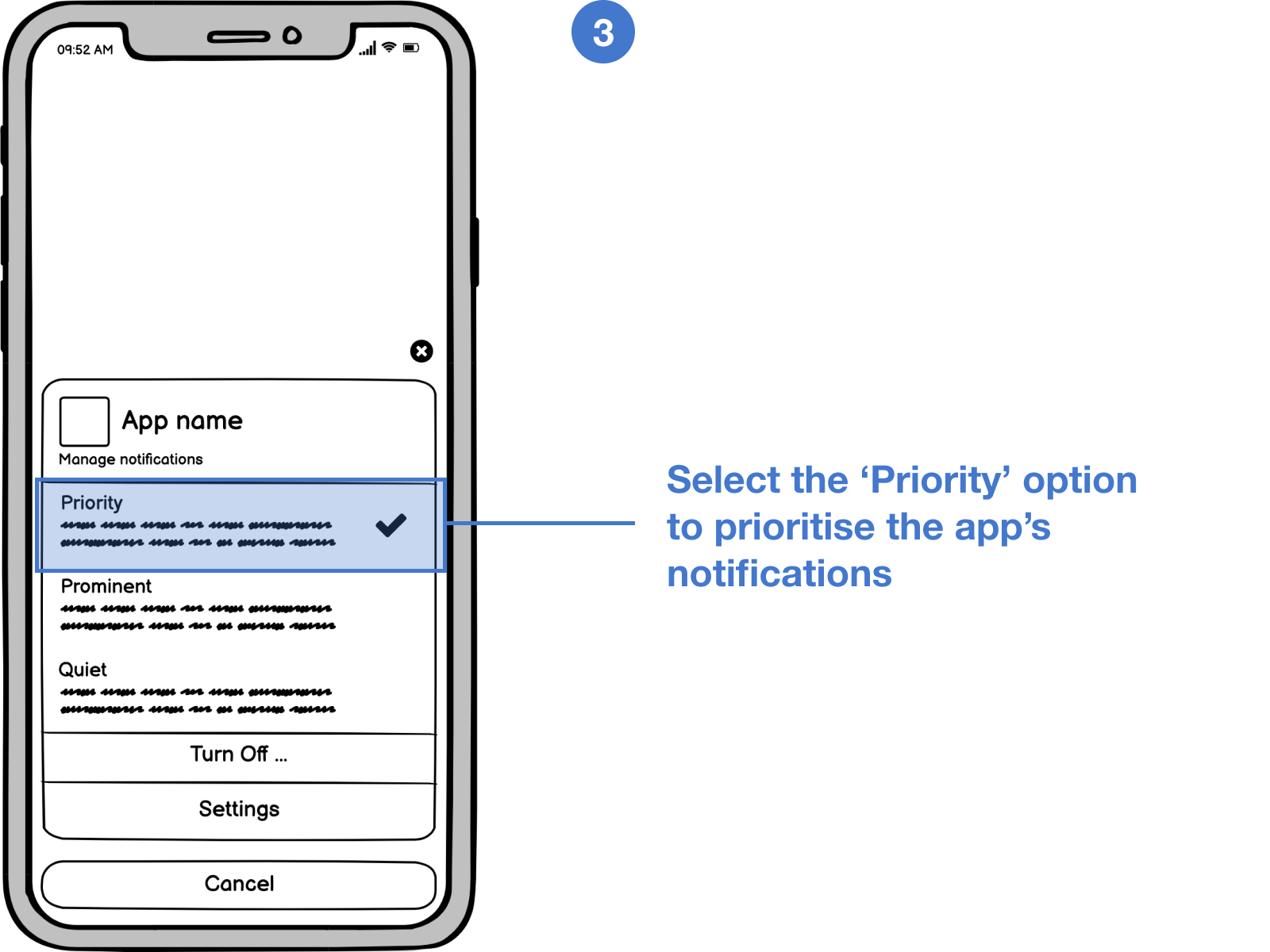
Additionally, one can also prioritize notifications from a specific app from the notification shade itself.
Issues
What do iOS notifications lack, and how does that affect the experience of power users?
In iOS, the most promising features are delivered in unintuitive ways and prevent the users from having a complete experience.
Redundancy with right swipe and tap to open
The concerned app can be opened by tapping on the notification. Additionally, swiping right on the notification does the same thing.
The complexity of minimize and clear buttons
The minimize and clear buttons alternatively switch between icon and text formats, and an extra tap is required to get the work done.
Lack of smart suggestions
In case of texts and messages, one can either long-press on the notification or swipe left and then tap on “View” to reply. This is not an intuitive flow.
Inability to snooze notifications
Currently, there is no way to snooze the notifications. Either you leave the notification unattended (which results in a cluttered list of notifications), or you take action on it.
Poor grouping and organization
By default, the notifications are grouped “automatically,” which is not helpful. Though there is an option to group notifications by app, it must be manually turned on for each app in the system settings.
Proposed Changes
I came up with some adjustments to the notification center and conveyed my ideas with wireframes
The minimize and clear buttons are replaced by arrow-up and cross icons, which perform the desired job in a single tap.
Swiping right on a notification reveals the “snooze” option, removing the redundant option to “open.” Tapping on the “snooze” option reveals the menu to select snooze duration.
Swiping left on a notification reveals the same set of options as previously, but the “manage” option now has a revamped menu. There are three delivery options for notifications — priority (appears at the top of Notification Center), prominent (normally), or quiet (appears in the Notification Center silently).
Notifications regarding messages and conversations now have smart suggestions for replying quickly. A single tap on them reveals the keyboard. One can add additional text or directly send the reply.
Mockups
Integrating the solution with the iOS design language
Based on the solutions I conveyed through wireframes, I showcased the outcome by producing high-fidelity mockups in Figma, which provide a realistic view of how these changes would look in iOS.
Reflection
What did I learn?
This project taught me how to work with constraints of existing design language. The focus is on problem-solving, as the visual style guide already defines most aspects.

This was also a different experience since I worked on a system-level component rather than a new app or website concept.
Thanks for reading!
More projects